Logo & identity design (Case Study)
Concept
Harwood Accountancy
Year
2025


Starting with sketching (sketching and note-taking is ongoing) and research, both general desktop research via online sources and design books, as well as industry-specific research, which is mainly visual. Since this is a concept for the website, I did not explore second and third options.
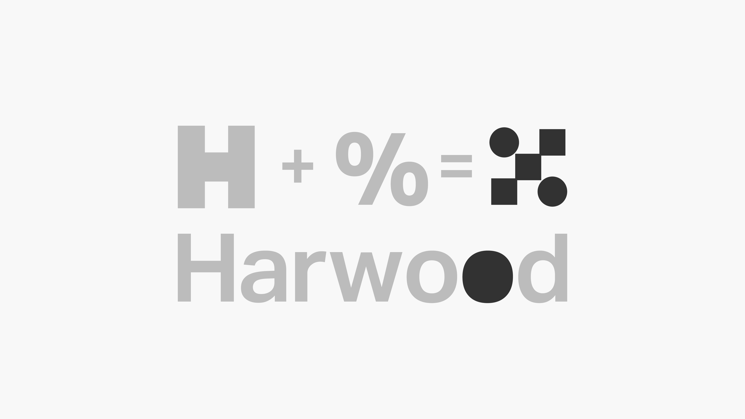
After I was confident I had a strong, bankable concept, I followed through on the idea, creating the logo mark and then adding typography to form a combination mark. I first worked in black and white and greyscale before moving on to color, choosing two blues and adding a secondary blue to bring more life to the logo while making the percentage sign more legible.
Small tweaks were made to the circles in the percentage sign, replacing them with the shape of the letter ‘o’ from the typeface to enhance consistency.
Next steps
The next steps would be to build up the identity from the foundations set by the logo. This would consist of an expanded colour palette and font usage to images, Various logo
lock-ups and media implementations.
-
Research & Ideation
Conduct general desktop research (online sources, design books, and industry-specific visual research).
Take notes and sketch initial ideas throughout the process.
Since this is a website concept, alternative options were not explored.
Concept Development
Identify a strong, bankable idea to move forward with.
Create the initial logo mark.
Add typography to form a combination mark.
Black & White Refinement
Develop the logo in black and white first to focus on form and balance.
Ensure clarity, scalability, and overall design consistency.
Color Selection
Introduce two primary blues, later adding a secondary blue for vibrancy.
Adjust the percentage sign for better legibility.
Final Adjustments & Consistency
Refine details, such as the circles in the percentage sign, by replacing them with the ‘o’ shape from the typeface for consistency.